
Exercise 3.6 Viewpoint
- Jan 25, 2020
- 4 min read
This section focused on viewpoints and thumbnails, so it was nice to have a break from exercises that ended with a finished artwork so that I could try and refine my process for generating thumbnails and rough drafts. Once again I had a list of choices to pick from as a subject matter for experimenting with different angles and compositions.
Festival | The morning after | Summertime | Workshop
Out of the four options, Workshop felt like an appropriate choice as my brother has his own workshop space which he kindly let me explore for this exercise.
This meant that I had a wide selection of tools to arrange as objects, but I stuck to mostly hand tools in the desk area that's most commonly used as a workspace as they were some of the most representatives of a crafting space. I shuffled the items along the desk and regularly rearranged the scene, eventually taking around 65 photos. I sorted through the duplicates and less interesting scenes to end up with the selection of 24 as seen below.

As I moved around the area, I tried to hit as many different angles as I could with some from above, some from underneath the table and others at odd angles or close and far away from the tools. I found this kind of photography really relaxing, especially when there wasn't a set arrangement that I was striving for. I would regularly change where the objects were placed, some of them being scattered randomly or pushed aside to land naturally, and for others I would make careful stacks or rows in a deliberate way to keep them in frame.
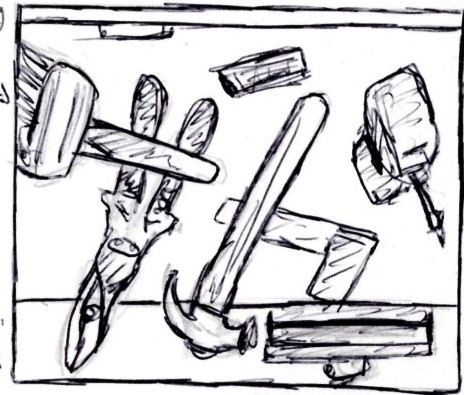
Next, I needed to repeat the process in my sketchbook but this time using different aspect ratios as thumbnails. I prepared a series of irregular boxes and filled them with sketches from the objects in front of me. I found this difficult to adapt to at first as i'm used to creating thumbnails either completely from my head during the planning stages of a piece, or working accurately from a photo and this was somewhere in between. As a result I think some of them ended up a bit more visually noisy than I would have liked.

After a while, I think I got the hang of it though and I found a better rhythm for ideas by began bouncing back and forth between taking additional photos and sketching as each medium provoked an idea for the other. The example that I chose as a favorite was composition 8, which served as the inspiration for the photograph below.

I used this photograph as the basis for a line drawing of the same scene. I feel like it as although this is quite a standard angle of a workspace, this is the viewpoint that someone would have whilst working and the most appropriate for communicating that action. Not everything is in frame, suggesting that there is more to be seen and this is only a small part of a larger working environment and the inclusion of the vice on the edge of the bench helps to solidify where the objects are living.

This isn't the most accurate representation, but as this wasn't required to be a finished drawing, I decided not to stress too much about pinpoint accuracy on the placement of each object. With that said though, I do wish I had done better at making the perspectives more accurate to my photo reference, particularly with the drill. I also realised I had mistakenly still used the aspect ratio from the photograph instead of from my thumbnail for my line drawing. To see what it could have looked like so i've digitally cropped it into the correct format below to fit the aspect ratio of the one in my sketchbook.


Finally, I was asked at the end to answer a few questions here about my thoughts on this exercise.
Which viewpoint best fitted the word your objects Illustrated? Why was this?
The viewpoints that I felt worked the best were the ones that included some of the environment rather than just the tools. I feel the workbench and vice were necessary inclusions to encourage the viewer to think more about a workshop that just the tools alone. The image I used as a basis for my line drawing does this well, but a few others photographs also share this quality.


Which format best illustrated your words?
Despite my choice of format for my line drawing, I think the more successful ones were wider aspect ratios. These could clearly show off more of the bench and a variety of extra tools without sacrificing the message or becoming too cluttered and unclear. In retrospect, I think my second thumbnail sketch would have been an interesting alternative to explore in this regard.

Did changing viewpoints make you think differently about your choice of objects and arrangement of them?
Definitely. From some angles my objects seemed too posed and suggested a less active purpose for the tools depending on where I placed them. For example when everything was lined up in a neat row, the tools appeared inactive and not in use, whereas if i positioned them at odd angles, they would appear only temporarily out of use off to one side, rather than tidied away.
Although I was a bit clumsy with my drawings in this exercise, I still feel that it has been beneficial in showing me how I could improve my thumbnails by taking an approach that allows me to play around with different viewpoints of the same setting to tell different stories. Through knowing that there are multiple ways to pre-visualise a composition, I should hopefully start to shake off the idea that I should lead with my first instincts for planning compositions in my projects.


Comments