
Exercise 4.2: Museum Posters
- Mar 22, 2020
- 10 min read
I currently work my as a Visitor Services Assistant for Derby Museums and in the past I volunteered to create media for the museum that draws inspiration from its exhibits and collections, which can be seen in posts under the museum category of my blog. Through my time working there, I have grown a love of making images to be seen by public and so I was naturally excited to once again bring together the two professions that I am the most interested in. The task was to design a series of A3 posters for a local museum that target the following three age groups as audiences:
Child (5-9) | Teenager (13-16) | General Adults
I've worked on activities and instructions for children and families before, but not in this capacity to design posters for different age groups at the same time, so I set out to investigate Derby Museum and Art Gallery for what objects from the collection I could interpret into posters. I also asked some of my colleagues for advice in creating brand appropriate posters so I could bear in mind any limitations as I progressed, and I was shown what the marketing departments brand guidelines are for the organisation, which became particularly useful to know when it came to formatting the posters later on.
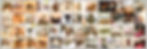
I'm already used to observing what kind of objects differing age groups would gravitate towards from experience, but I still felt it necessary to visit the museum as a member of the public during a busy day at half term, to remind myself what it is like to see the museum when i'm not working a shift there. A reminder of public perspectives was useful and I took many reference photos of relevant and popular objects to that I later sorted into general age groups. Theses groups are not mutually exclusive however, as there is always some overlap between when a exhibits can provide alternative interests to a variety of visitors from different backgrounds.
Child (5-9)
In their early years, children are attracted to the simpler shapes forms found in animals and nature that offer them comfort and familiarity. At the museum, this means that children and families tend to congregate more around the Notice Nature gallery, where taxidermy and interactive exhibits can offer immediate entertainment for them. Visitors in this age group may not yet be at the level that they are independently seeking information from written material, but they are highly inquisitive and often ask questions about these kind of objects to parents, guardians and members of staff.
Teenager (13-16)
An interest in the more historical aspects of the collection by teenagers isn't as common as it would be with an older visitor, but it can be the case that the novelty of an unusual exhibit can provide something for teenagers to engage with. The World Collection gallery offers a variety objects that provide an insight into multiple cultures and customs that they may not be normally exposed to and the more seemingly odd an exhibit is, the more likely teenagers are to photograph, share and talk about them amongst their friendship groups, either in person or across social media. It's for this reason that the nature gallery also still stays popular for teenagers as it provides opportunities to see bizarre specimens such as the platypus or prehistoric specimens.
Adults
As we age and gather more life experience, our interests in the stories and history surrounding an object can grow beyond appreciating the form and function of them. Provenance and origin become more relevant when viewing an exhibit and as personal interests become more specific, adult visitors hone in on trying to acquire as much accurate information about the objects that they have developed personal connections with. The objects in the Archeology, Soldiers Story and military galleries offer this kind of information in bulk and in the Joseph Wright gallery the paintings by the titular artist offers historical insights into time frames they were painted in, provoking many discussions between visiting adults.
I wanted to also consider what is the purpose of museums in society and why they attract members of the public to support and visit them, so I expanded on these thoughts through a spider diagram that gave me some interesting areas to try and read into. The Museum Association in particular has some interesting articles that feature studies into why people visit and the public perceptions that exist of museums.
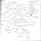
The idea of museums as stuffy and antiquated institution has shifted over time to become places seen as not only representing the preservation the past but to also to look at current and future events in society. Visitors as well as staff have formed strong emotional attachments to objects that have personal connections and they are passionate about how they are displayed and used for both education and leisure. This means that museums today more than ever have a distinctive purpose in acting as centre for ideas in society and I wanted to include as many of these values in my designs as I could.
From a technical perspective, I was looking through my photos and became inspired by the way that at certain angles the lighting on the exhibits cast shadows and silhouettes on the walls. Feeling that cut paper illustration could be an interesting medium to interpret the objects with, I could potentially stage an arrangement that connected with the arts and craft side of museum activities through using a delicate material that is also readily used in archiving and preservation. This meant I had to anticipate the practical limitations of a new medium in my designs, so I looked at the work of current cut paper artists and illustrators for inspiration.
Eiko Ojala may use digital means to give his hand drawn illustrations a paper-like look, but this doesn't detract from the layers of depth he has managed to create in his work. Paperboyo on the other hand uses simple card silhouettes to make inventive photographs that alter urban locations in unexpected ways and the idea of having an illustration supported by the context of the environment it is photographed in really appealed to me. Lastly, Jayme McGowan shows how to arrange fully active scenes from vertical cut outs and I considered how this kind of theatrical staging could be used in my own work.
I then began sketching out my ideas, which was surprisingly a more difficult process than usual for me. Although I had lots of context on where to approach things from, narrowing down what single objects I should specifically use was tricky as I think that the wide variety that museums offer means that there is no object that can be used as a single symbol to represent an entire age group. If these posters were for a specific gallery or featured exhibition then I could narrow the focus a bit more, but as a set of posters to advertise the museum as a whole, I was having some trouble arranging my thoughts.

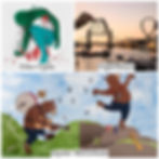
For the children's poster, I had the idea to make the main point of interest the silhouette of the 1800's side of the museums exterior that opened up or was surrounded by a host of animals from the collection using simple rounded shapes and bright primary colours, the majority of which reflecting or complementing the museums main logo variant. This would be displayed on a table almost as if it's a part of a craft activity with the intention of appealing to parents and relatives as somewhere to visit with their young children and make an interesting staged menagerie. Books or other crafting materials could be used to support the arrangement along with other props related to crafting such as scissors and glue.
Teenagers can be difficult to design for as trends move fast, but as an object to focus on, the ammonite has a distinctive shape that can be converted to make it look angular and technological. I felt that this would be an opportunity to modernise a symbol that's often associated with museums being old and outdated. If I built my prop to be a free standing 3d object then I could also place it against clean technology based backgrounds. I also tried to look at interior design palettes interior design of a teenagers bedroom for colour inspiration and settled on variations of secondary colours like greens, blues and purples as I felt like they would be a good fit to compliment those seen in the organisations logo.
My thought process for the general adult poster took a different direction in attempting to produce something more refined and elegant. At first I had wanted to make a complicated single sheet that reinterpreted some of Joseph wright's paintings to appear inside the frame of the museum, this would be an interesting piece to see as the paintings and artwork merge to form a complex lattice effect, but for a poster I needed to simplify to make it readable from a distance. For this reason I opted to choose one of the not often human sculptures from the back of the museum as a symbol for classical artwork. It would be cleanly and simply cut on crisp white card to show shadows and details from the face, hair and torso against a dark background.
Although I had managed to come up with these concepts, at this point I felt that needed to start working with them digitally in order to work out the specifics of how they would actually look. I felt that I could make better progress by using my object photos to manually trace and manipulate the line styles in Adobe Illustrator and then I could experiment with exactly how exactly to place them in photoshop, where most of my decision making took place for the final look of each design.

Now that I was working more instinctively by trying out different scales and sizes around my objects, I could create a set of mock-ups that felt balanced and interesting to look at. I had some ideas on where I could photograph these in the gallery, but for the mock-ups i used similar backgrounds from stock photos. A brightly lit educational setting for the children's poster, a music production board or technology panel teenagers, and some darkened old wooden panelling from the older sections of the museum for adults.

The three mock-ups for the design all take different approaches for each age group, but still stay connected through similar placements text and information, although with some subtle differences in underlining and logo variations for visibility. After seeing the immediate image, I wanted the viewer to follow the hierarchy down the poster to the name of the museum below and then across to the right for the other relevant contact information. I kept the typography simple and clear in the lower sixth of the frame by using the easily legible font Scala Sans as recommended by the museums marketing guidelines.
At this point the exercise only mentioned taking one of these concepts through to a finished design, but given that illustrations that i used for the mock-ups were ready as templates to be cut anyway, I wanted to put the extra effort into making all of them into final posters. I printed out the templates and used a cutting mat and blade to produce all of the assets I needed on coloured card that matches my concepts. I then visited the museum on a day when it was not open to the public so that I could make full use of the gallery spaces to explore lighting options for photographs of my objects and scenes.

For the children's poster layout, I had originally intended setting up the diorama in the Activity Room as it's the dedicated space for educational activities, but The Coffee House and had much better lighting conditions for the types of shadows that a wanted and offered a bonus view into the ceramics display in the background. I placed each of my cut-out's in different arrangements using a stack of books and held them up using some clear plastic standees that I salvaged from an old board game until I found compositions that I liked.
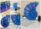
The ammonite was constructed out of four sections and held together using a precarious mix of tacking, cotton swab sticks and carefully applied hot glue. In hindsight I wished that I had engineered a more efficient technical approach to making this sculpture free standing, but it still served its purpose well and I got some great images of it being illuminated by the bay windows and standing on the music panels at the back of the World Collection gallery that make it look clean and modern, although unfortunately the mask towards the centre of the spiral was too obscured to be distinguishable in practice.
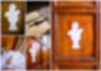
At the back of the museum I took advantage of the natural light by photographing the cut-out of the bust against the wood wall panelling. To create a shadow underneath it that would make it stand out in the same way as in my mock-up, I used the same paper standees frome before and tack to slightly project it from the surface. I experimented with a few other unusual options here too as for one shot I dropped the template from above and caught a surreal snapshot where it had just made contact with the floor, projecting a long shadow in front of it.
When all my photos were imported and sorted in Lightroom, the final posters were simple to assemble in Photoshop. I spent some time aligning the various logos, text and information at the base of each image in a slightly different way than with my mock-up's that I hoped would look fitting against each background image while still staying in a uniform position across the three posters. Adding a subtle drop shadow behind the lettering really helped to maintain the visibility against the paler backgrounds of the child and teenager edition, but in the case of the general adult poster I ended up swapping out the originally planned perspective of the background image to one with less visual noise behind the the lower section of the frame.
This project took a lot longer than I anticipated, yet I still feel that I could have explored more options for each of the posters during the development stage. I think this might be a consequence of working on three ideas simultaneously and that may have put me at a creative disadvantage when it comes to narrowing my focus. In future with a project like this, I would instead work on each age group in turn, then unite them at a later stage rather than attempting them all at once.
This isn't too much of a negative point to dwell on though, as I have received some positive comments from my colleagues after showing them the final designs, so do hope that I have still created three distinctive designs that would be visually appealing to the target audiences that meet the specification of the exercise.
Bibliography
Derby Museums At: www.derbymuseums.org(Accessed 22/03/2020).
McCor, R. (2020) At: www.instagram.com/paperboyo (Accessed 22/03/2020).
McGowan, J. (2020) At: www.abramsandchronicle.co.uk/blog/the-making-of-one-bear-extraordinaire(Accessed 22/03/2020).
Museums Association (2020) What the public thinks. At: www.museumsassociation.org/campaigns/museums2020/11122012-what-the-public-thinks
Ojala, E. (2020) At: www.ploom.tv(Accessed 22/03/2020).