
Exercise 4.2: Concrete Poetry
- Feb 26, 2022
- 7 min read
Updated: May 27, 2022
This exercise asked me to look at concrete poetry, a literary and visual art form where poets have enhanced their words through the visual form of the text. The first part task involved some research into the subject alongside an analysis of an existing work, and in the second I needed to create my own example of concrete poetry using the poem Tango with Cows.
I initially didn't know much about concrete poetry, so I began by looking into the art form and associated movement in general. Visual forms of poetry are not a new idea by any means and examples have been found that date back centuries, but the term concrete poetry is much newer and refers to the artistic movement post second world war. Taking its name from the concrete art movement that shared a philosophy of form over meaning, concrete poetry is a catch all term for any poem where the shape and arrangement of the words is considered more important than the literal meaning of the text.
My first visual impressions of the genre was that many examples looked quite minimal or simple in their execution, but as I looked through the other artists on the list I saw that manipulating the colour, transparency, spacing, rotation and structure of letters, words and sentences can create a wide range of results, even using only a single word as a starting point. I admire the ways that concrete poets use the overall arrangement and restructuring of what would be a normal reading pattern to create something that transcends the presentation of traditional poetry into something new.
Critical Writing Task
As I researched artists from the recommended list in the course materials, a few poets and artists stood out to me as options for the critical writing part of this task. The work of Mary Ellen Solt caught my eye in particular as she also created calligrams to shape words and letters into images, as I did when exploring experimental typography. In favour of exploring something new however, I chose the poem flow grow show blow by Eugen Gomringer to analyse in my sketchbook.

The unique shape of the poem is constructed from the repetition of the four words that make up its title, with the lengths of each line arranged to form an abstract shape of a curved and repeating pattern. Smaller words are used on the shortest lines using the same letters, and all the words share the same phonic of an "oh" sound. The curves and motion of the shape connects with each of the words in parallel and I can see how the words 'flow' like waves and 'grow' as branches horizontally and vertically. show is a looser word to connect with the shape, but my personal impression is that it reminds me of flags and bunting from a show or a fete. Finally 'blow' is represented by the motion of wind patterns or flags flapping in the wind.
The way this overall shape is constructed also changes the direction that the eye travels as I read the words. Although he poem is still read from left to right, I find myself reading upwards from left to right in an ascending diagonal motion, which further connects with the 'growing' theme as it moves up.
Overall I really admire how much has been done here with only word patterns and a single typeface and I notice that Gomringer often uses the famous clean and minimalist form of Helvetica in his work. This is in line with the concrete poetry philosophy of prioritising the overall image rather than the individual words, but I can't help but wonder what the poem could have looked like using italics, cursives or other slightly more elaborate letter forms that give the impression that they are flowing, growing, showing and blowing across the page.
Visual Task
For the visual task, I was asked to interpret my own version of Tango With Cows, an important piece in the concrete poetry movement when it was published in a book of the same name by Vasily Kamensky in 1914. The original release drew attention for being printed on commercial wallpaper and containing a selection of concrete poems, including the one that lends the book its title.
Poem: Tango With Cows
Life is shorter than the squeal of a sparrow.
Like a dog, regardless, sailing
on an ice floe down the river in spring?
With tinned mirth
we look at our destiny.
We - the discoverers of countries
conquerors of the air
kings of orange groves
and cattle.
Perhaps we will drink
a glass of wine
to the health of the comets,
expiring diamond blood.
Or better still – we’ll get a record player.
Well, to hell with you!
hornless and ironed!
I want one - to dance one
tango with cows
and to build bridges
from the tears
of bovine jealousy
to the tears
of crimson girls.
The exercise placed a few limitations on my visual interpretation; To use only one font, and to use a material from the previous exercise as the printing medium. I went searching for industrial fonts and found Cy in the adobe creative cloud. I felt it was fitting because of the clashing mix between some letters being fully curved, and some being

With this in mind I then started to think about how I could visually interpret the poem through simple sketches and collages in my sketchbook. In the 1950's and 1960's when concrete poetry movement was at the height of its popularity, letterpress and typewriters were the common tools for manipulation, so I felt it important to begin workshopping ideas for forms on paper first before moving on to digital work.

I then used these ideas as starting points for creative experimentation with arranging the words into images using Adobe InDesign. Looking through my initial sketches, I chose three solutions that ranged from the abstract to the illustrative to get feel for which idea to progress with further.

My first option was based on a zig zag pattern that followed the same line structure as the orignal poem was written in the course materials, but staggered at angles that emulated the back and forth path of a dance routine across the page. At first I had the text all at the same size which felt too simplistic, but when I tried making each line one point size bigger than the previous, I ended up with something with a much more interesting dynamic. Now, as the frustration of the poet grows, so does the size of the text as it tango’s towards the viewer.
The next option was based on the pattern of footprints that would be left behind by cattle, either on the soil in a farmyard setting or if they were dancing the tango as the poems title suggests. The execution if this was simple idea was trickier than it looks. Each hoof is a different line and each line is a different length, so I had to manage the size of each one to match the hoof print paths. once these were in place, i started to overlap them in ways that wouldn’t remove the legibility of the text, then finished with a dotted line that although doesn’t add much to the story of the piece, still helps to bring the other elements together as a guide for the viewer to follow.
The last design took more of an illustrative storytelling direction, with the concept of each verse or collection of lines would form an aerial view of cattle penned into a farm enclosure. A strong theme I interpreted from the poem is a longing for natural freedom, and I envisioned part of the final verse as a bull escaping from rest of the poem, starting with the line “to hell with you!”. I also like how this concept links in with one of the other meanings of 'to tango with’, as in to fight against something. My first attempt at realising this concept was a bit simple, but all the key elements were there, so I moved forward with this idea to enhance with further text manipulation techniques.

Firstly, I changed the structure of the pen to give it only one simple exit to make the scene feel more claustrophobic. Then by using perspective warp, strikethrough and flipping some of the lines, I could better visually inform the viewer that the words are acting as a fence. Next, I duplicated some of the cow verses to populate the main pen and adjacent ones and angled them slightly in more natural positions. To make sure the main verses are read in order, the main four are opaque and can be read normally, whereas the others are faded into the background and flipped to be less legible. Finally, the escaping ‘bull’ verse is highlighted in an angry red to mark it apart from the others.
To give the design an interesting printed finish, I printed it out onto some brown recycled paper from the previous exercise. I chose this for its dull colour and cheaply produced texture that feels reminiscent of the poems protest against industrialisation. I think it worked out well, and after a few minor adjustments to get the contrast right between the cow verses, I’m pleased with the result.
Critical Reflections
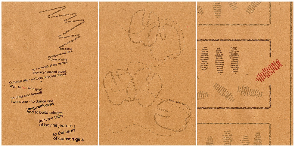
Out of curiosity, I also printed my two other designs from earlier and found them to look just as effective on the same paper, although the hoof prints have less clarity that the others do and could benefit from a thicker letter variations of Cy that I used for the others.
This was an entertaining exercise and a look into an area of poetry that I was previously unfamiliar with, but I hope that I've captured the essence of the artform with my attempts. It was useful to gain a further understanding of how text exists as a shape and form on the page, and that the arranging of words is not a practice bound only to literal meaning.
Bibliography
Britannica. (2022) Pattern Poetry At: https://www.britannica.com/art/pattern-poetry (Accessed 25/02/2022)
Getty. (2009) Tango with Cows: Book Art of the Russian Avant-Garde, 1910-1917 At: https://www.getty.edu/art/exhibitions/tango_with_cows/ (Accessed 25/02/2022)
Lyricline. (2022) EUGEN GOMRINGER flow grow show blow https://www.lyrikline.org/en/poems/flow-grow-show-blow-10150 (Accessed 25/02/2022)
Packard, C. (2020) Women Concrete Poets Who Pushed Against the Limits of Language (and Patriarchy) At: https://hyperallergic.com/587077/women-concrete-poets-anthology-primary-information/ (Accessed 25/02/2022)
TATE. (2022) ART TERM: CONCRETE ART At: https://www.tate.org.uk/art/art-terms/c/concrete-art (Accessed 25/02/2022)
The Art Story. (2022) Summary of Concrete Poetry At: https://www.theartstory.org/movement/concrete-poetry/ (Accessed 25/02/2022)


Comments