
Exercise 4.3: Sequencing Images
- Mar 1, 2022
- 5 min read
Updated: May 27, 2022
This exercise continued on from the last one by again working with Tango With Cows as my inspiration, but this time to construct a folding booklet of around 16 pages that contained visual content inspired by keywords in the text. As an open ended brief I could do this in any way that I chose.
Initial concepts
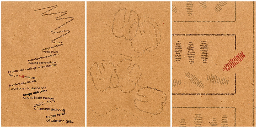
I prefer to start my designs knowing how the form and function of the final piece will be displayed and read, so before anything else I started looking at folding methods to know how to structure my content. 16 pages is a large amount to cover in a single folding sheet, but there are several inventive methods to make the most of a single sheet of paper available. The 16 page parallel folded brochure is one idea that I considered using, but I was also interested in map style gatefolds to be able to view 8 panels at once on each side. I made a mock up using a sheet of A4 paper to see how this could look.

When seeing the shape of the mock up unfolded, I was inspired to see if it could work as an enclosure to relating to the themes of feeling trapped that I interpreted from the text. My first mock turned out to be too tall to support this effect as it stands too tall, so to try and fix this, I trimmed the edges to turn each segment into squares rather than rectangles. I really like this new shape and designing for a square canvas would be a nice change of aesthetic.
I started by reanalysing the poem in the same way as I did in the previous exercise, but this time using the keywords as individual inspirations for page content rather than trying to condense the overall meaning of the poem as I did before.

From this I could then divide up the lines of the poem into 16 images inspired by phrases made from 1-3 lines that I could picture the most visually. I sketched out some initial ideas for these in my sketchbook, with alternative for each panel that would appear on the front and the back sets of 8 images that would be viewable when the leaflet is fully unfolded.

I didn’t focus too much on composition with these ideas, as I knew that I would find new ones based off my found images later on, but these very rough thumbnails still acted as a good reminder of my intentions for each image that I could refer back to.
Developing Images
After my initial designs, I moved into photoshop to start assembling images digitally, using creative commons and public domain images to realise my concepts. Each image features only one or two combined images that were improvisations based on the elements in my thumbnail sketches.

I didn’t have clear end goals in mind for how each one should look, so I explored the abstract and surreal playfully as I merged elements together. As I progressed I began to pair some of the images together that had similarities that I wanted to preserve, as with the two lines that represent ‘a dog sailing’ and ‘down an ice flow in the spring.’ When the colours didn’t match, I used filters and saturation adjustments to pair them better, and I did this the most dramatically with the natural red of the lava landscape in ‘To hell with you’ and the deep red colour layer over a scene of cattle branding in ‘hornless and ironed’.
I felt that some of these concepts needed some extra adjustments using practical materials, so I printed off each sheet and looked at them to see what kind of mixed media could be added to them. Working mainly with acrylics and a few inks and pens and occasional additional collage pieces, I embellished around half of my images when I felt that they needed something extra. In some cases this was planned ahead, such as the water overlay for the dog and sailboat, but in other places was improvised.


Some the effects tuned out well when rescanned to show the texture and flow of the brushstrokes, but not all my attempts were as successful at enhancing what I had already done digitally. A few of these ideas I saw as too overbearing for the rest of the image and decided t discard. For example the paint lines on the volcanic landscape turned out very messy and distracting and similarly the rocky outcrops on the following image of the branding scene superseded the reasoning behind making those image choices in the first place.
The biggest discovery that I had from this portion of the process however, was how much I liked the interplay between the panels that contrast the natural shapes of the photo's against geometric patterns and shapes. This originated in the white line trails in the 'conquerors of the skies' and 'diamond blood' panels and I saw this as a potential allegory for the fight between the natural freedoms and cold industrialisation that the poem suggests. Moving back into the digital realm for more edits, I wanted to revisit all of the panels to emphasise this this with their own additional shapes. I stuck to the white lines that stood out when obscuring the backgrounds, and in some images made the lines disappear behind objects as they interact physically with the scene.
I then arranged all of my squares on my full layout template once more, moving the tiles around to make them not necessarily in the same chronological order that they appear in the poem any more, but in ways that still as visually or thematically in connected vertical pairs. I omitted two of the weakest options to bring the number down to 12 and this was the image of the wine glasses and table, which was already symbolically represented in the comet example, and the record player, which just felt out of place and didn't inspire much within me to work into the narrative.

To fill the gap this pair left behind, I reinstated the zig zag cover from the previous exercise to give the reader some grounding for what the images represent, and to make it visually clear as a cover when folded up.

Finally, I printed, trimmed and folded the sheet as shown above, and I'm really pleased with how this small sheet has worked out and stands, both when folded and unfolded. It's an unusual layout and not something that I would normally consciously set out to create, but this was a fun exercise to think more abstractly about how we interpret a page and I hope that I've made a connected piece where each image is evocative of the lines that each one was inspired by.


Comments